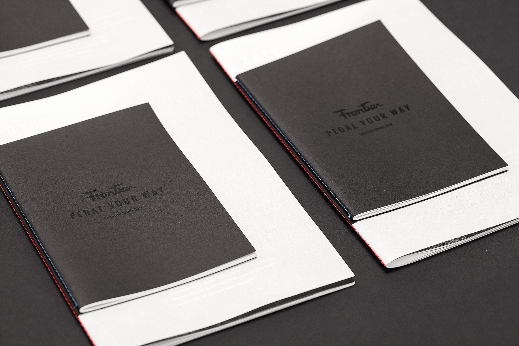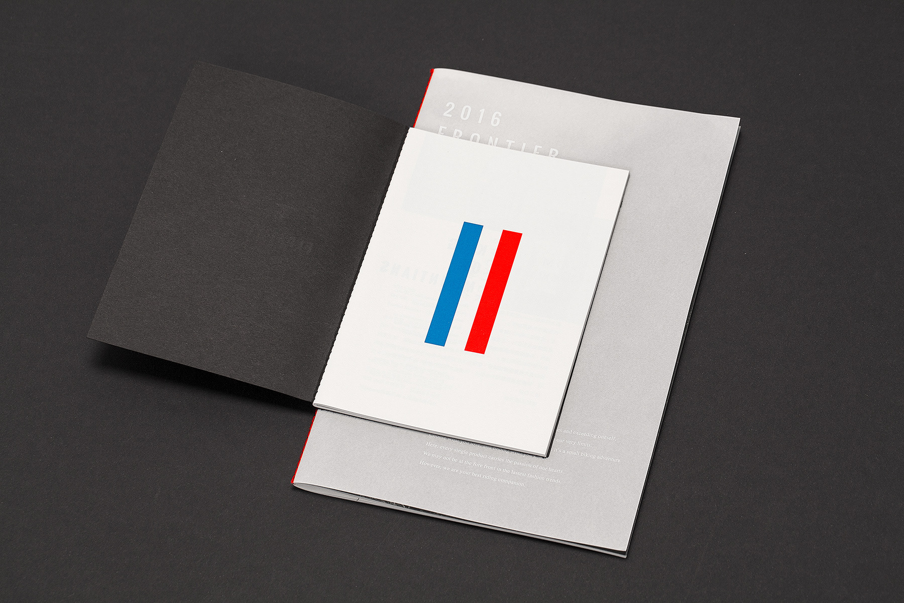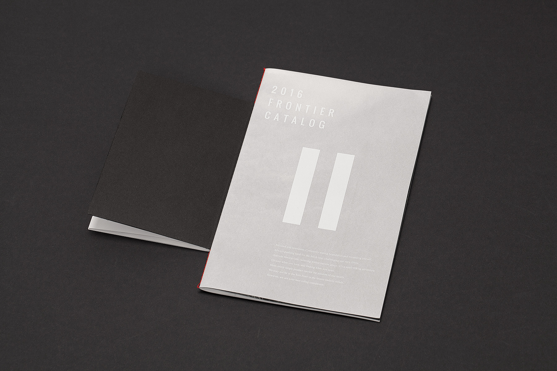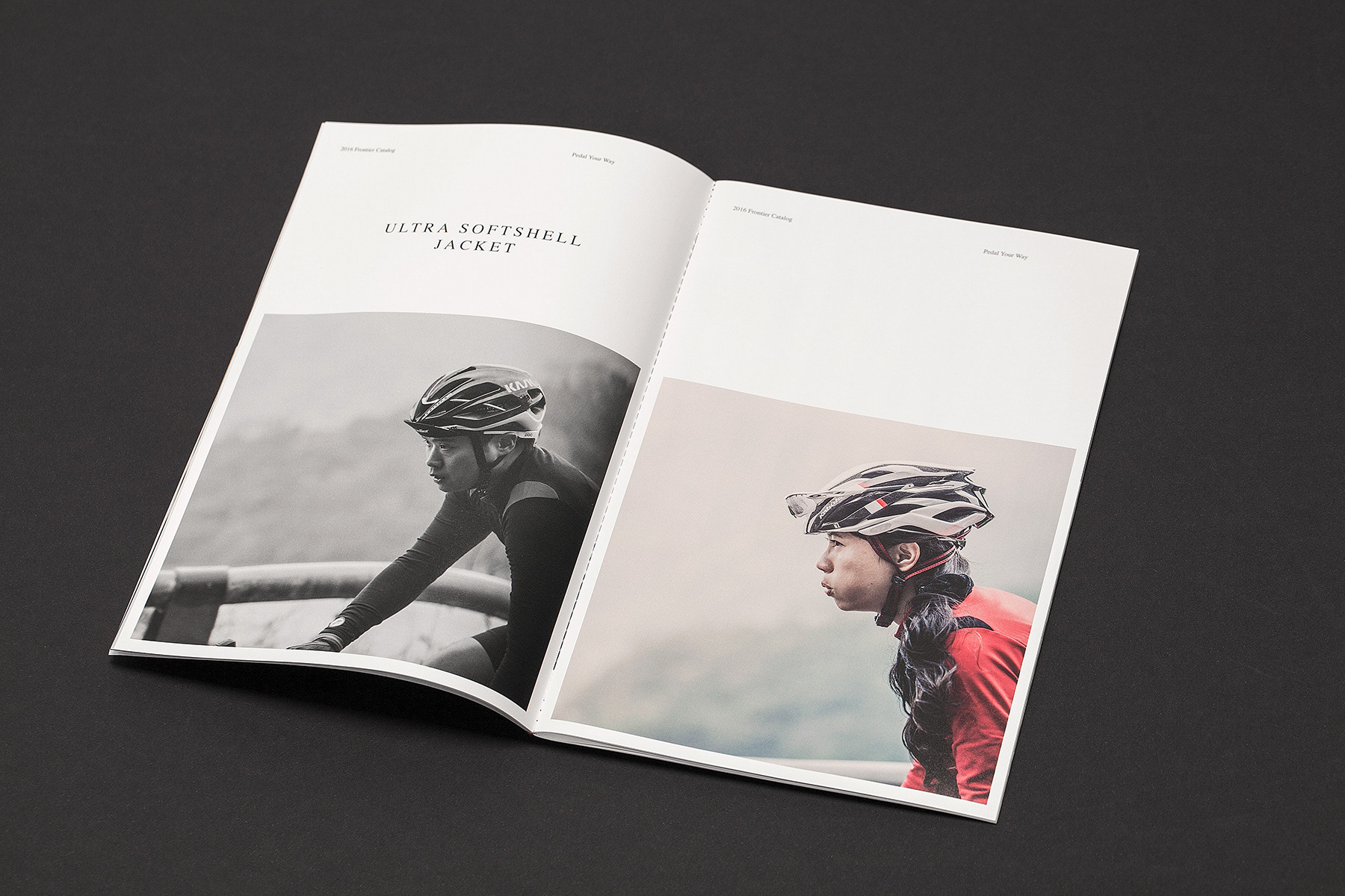
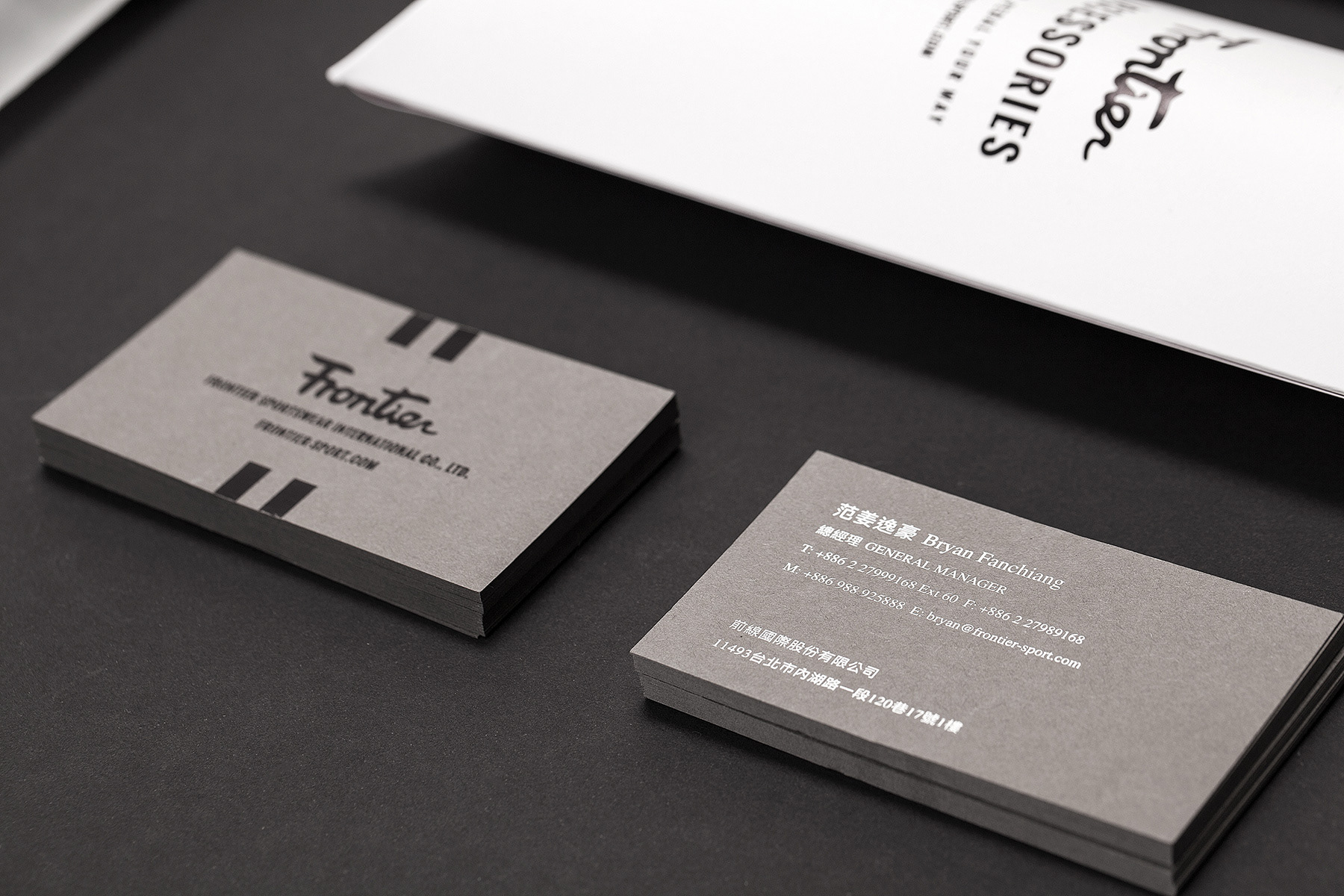
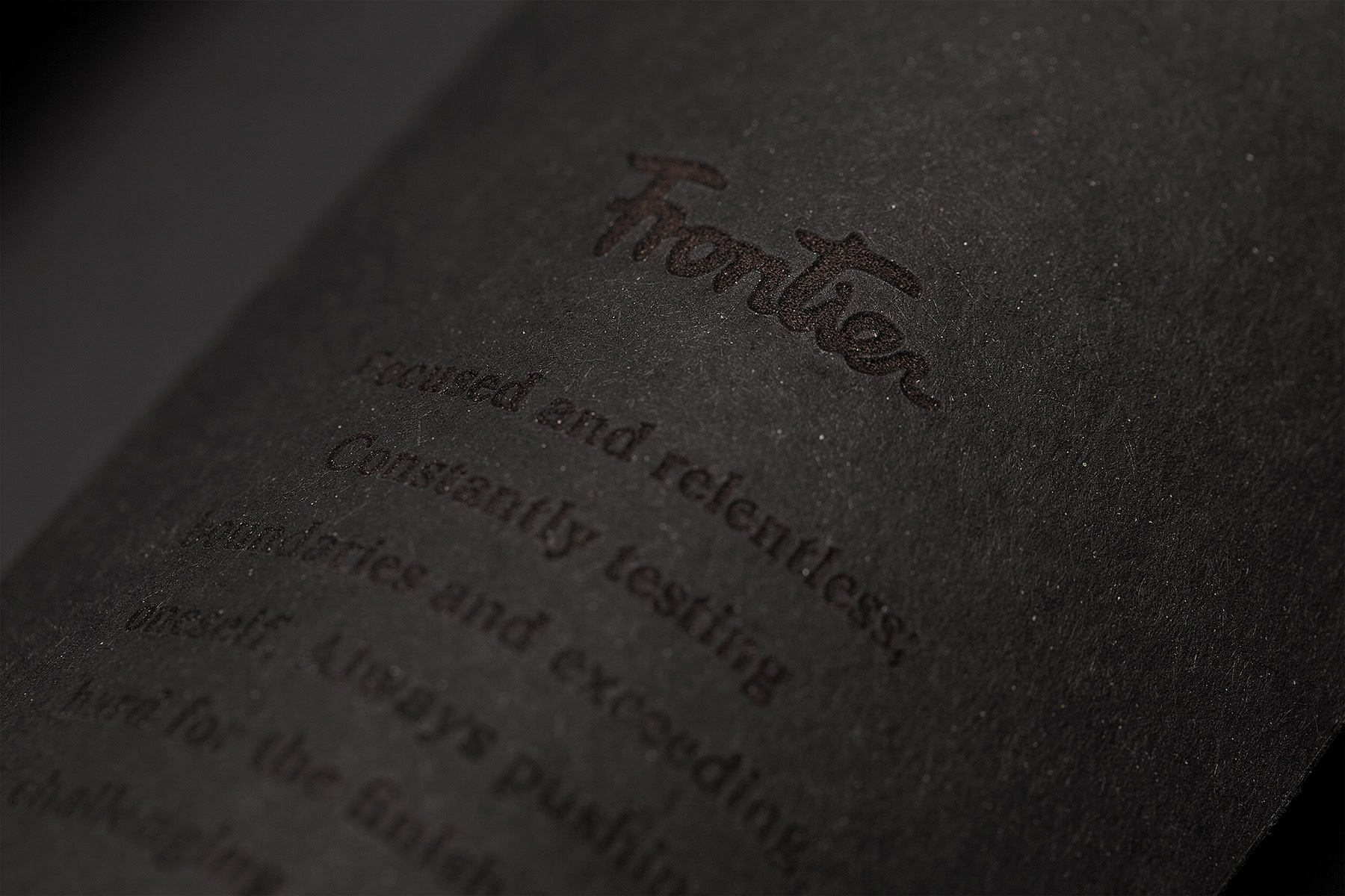
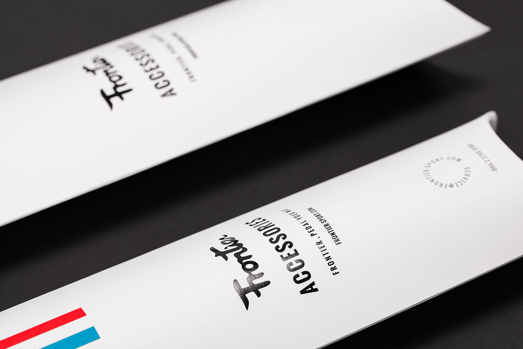
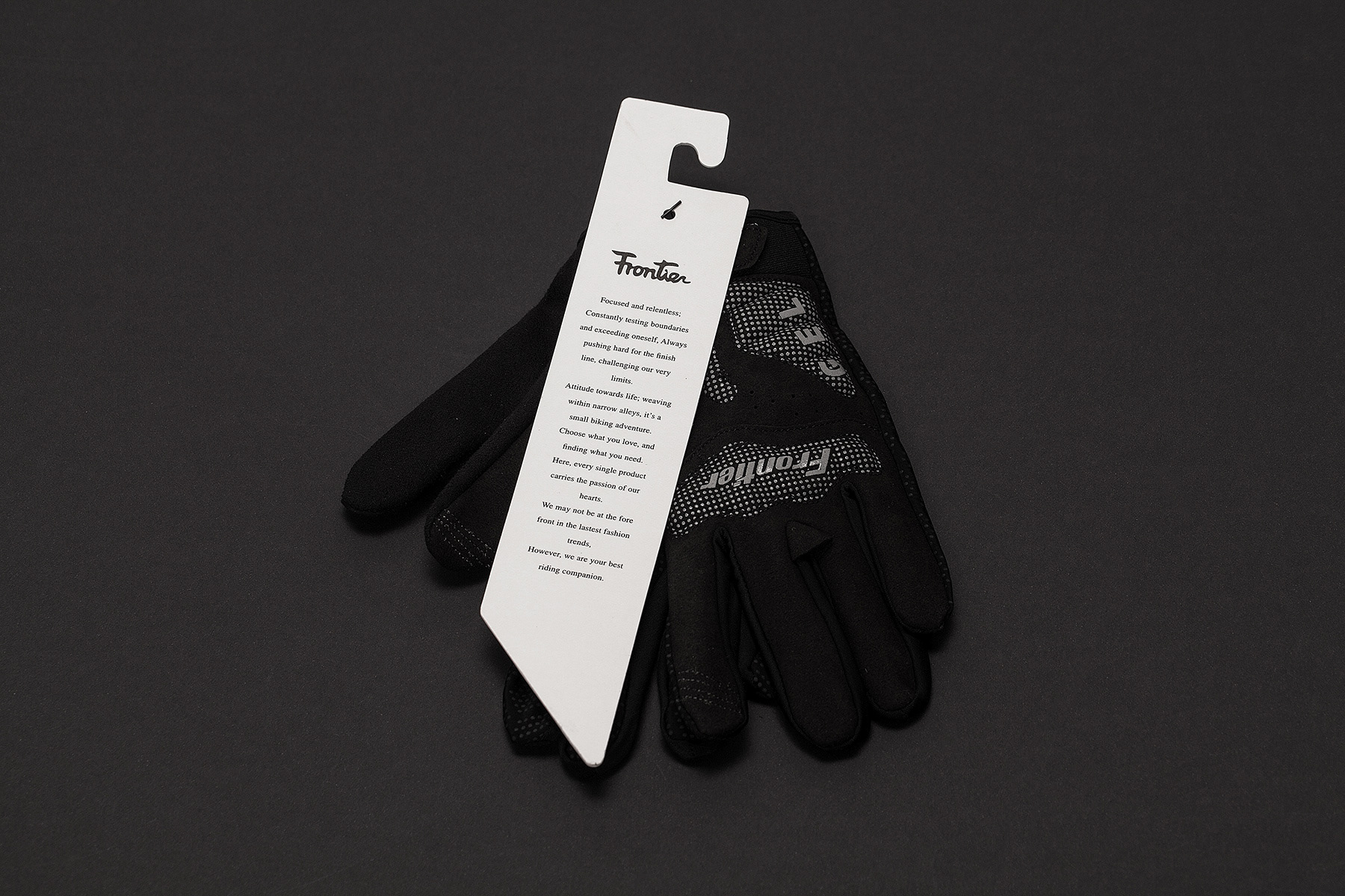
Frontier, 台灣本土車衣品牌,在經過六年的耕耘後,今年,品牌有了全新的樣
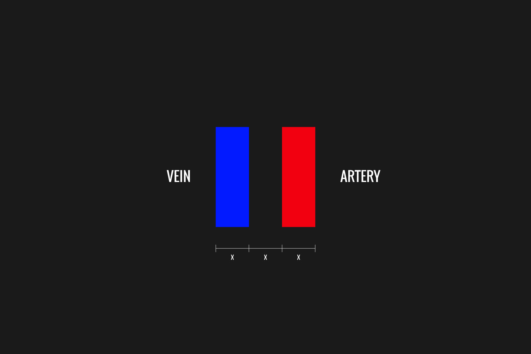
貌。原本強調速度感的LOGO,轉換成書寫體的表現方式,另外加上紅藍兩色
的識別,紅藍分別代表動靜脈,強調運動時血管的脈動,也是Frontier競技與休
閒的兩條產品線。
After 6 years of cultivating “FRONTIER”, the professional cycling
sportswear brand designed and manufactured in Taiwan, we decided to
transform our initial speedy expression logo into a more sophisticated
writing style. Furthermore, we also added two-color- stripe symbol. The
red and the blue represent our arteries and veins, and they also
represent our two main product lines- Frontier made for competitive
sports and recreational lifestyle.
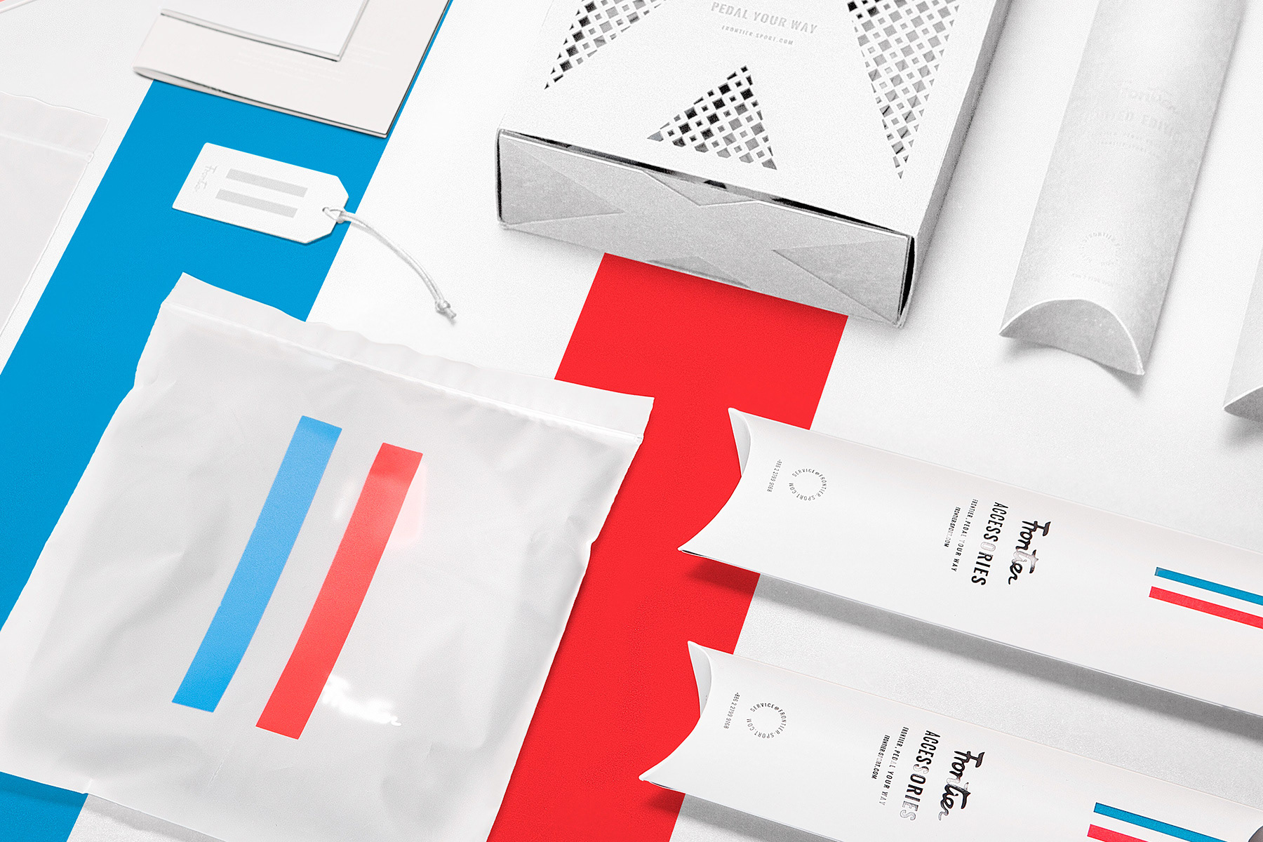
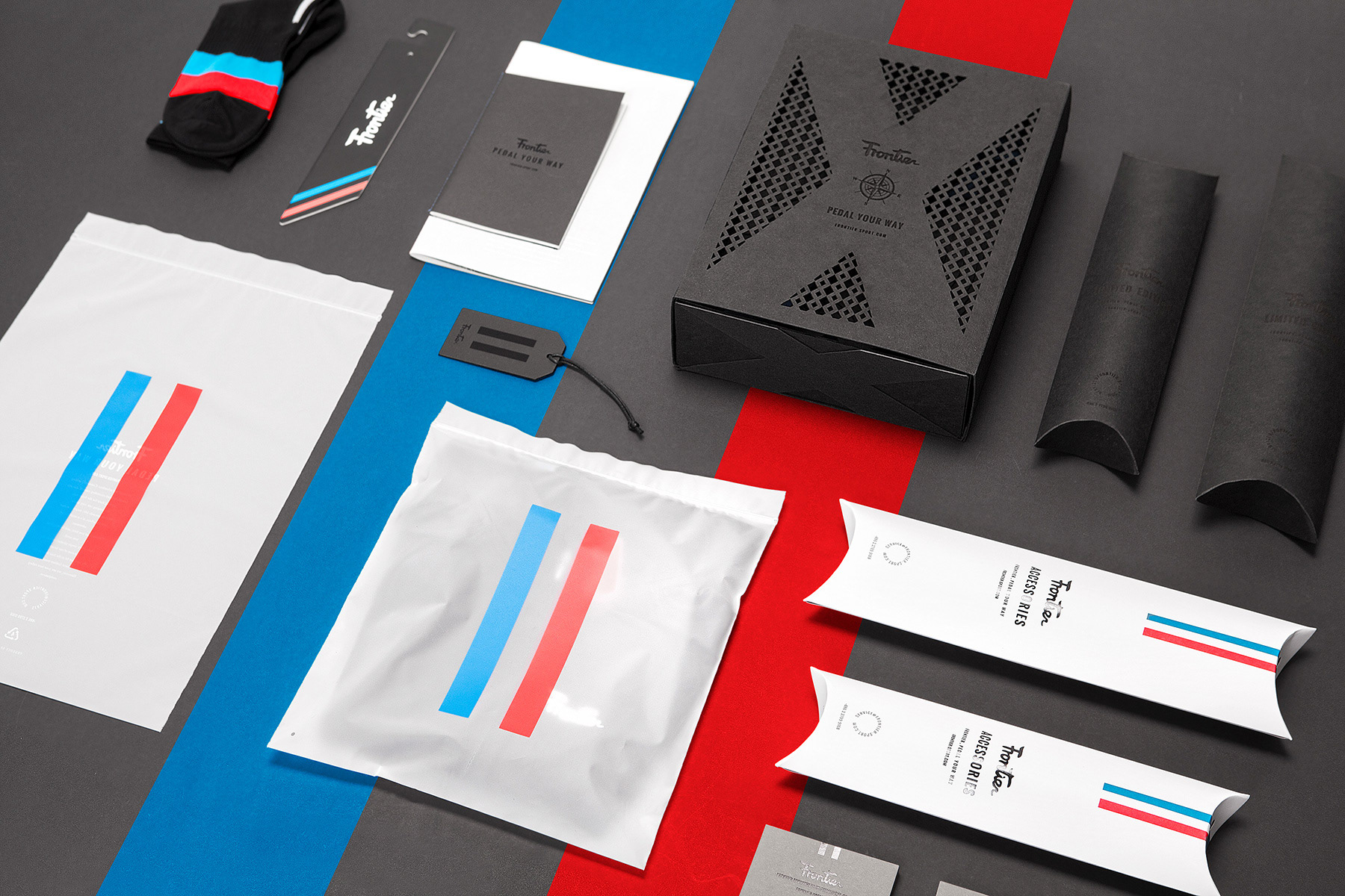
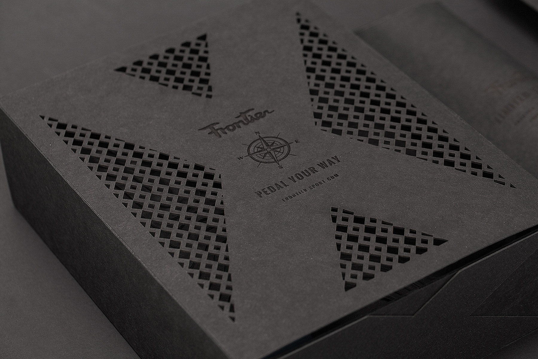
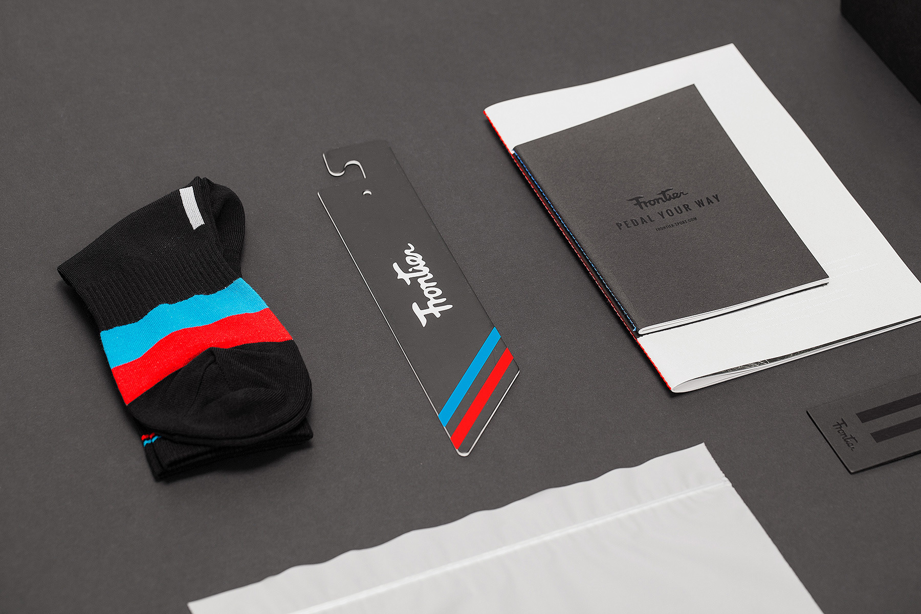
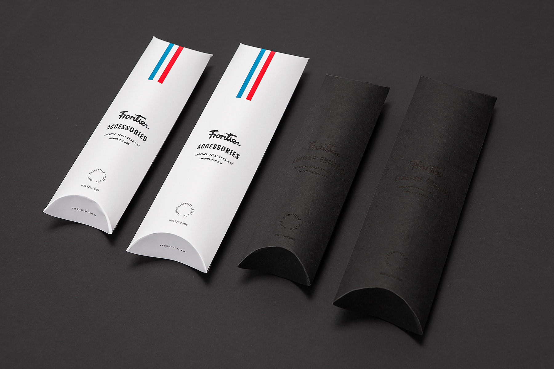
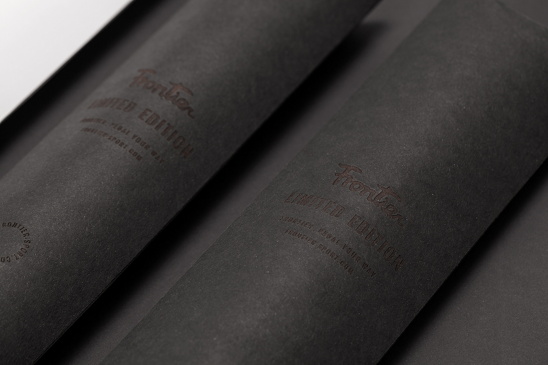
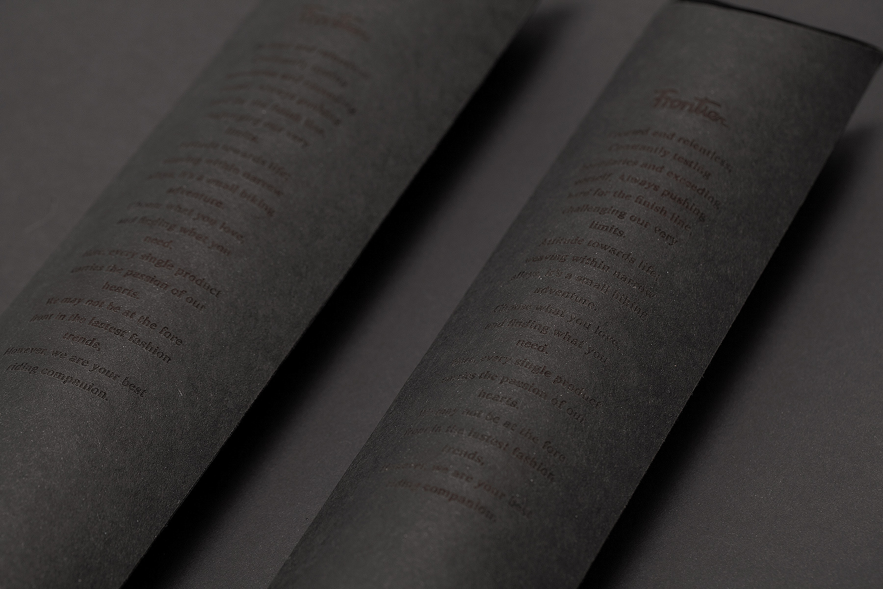
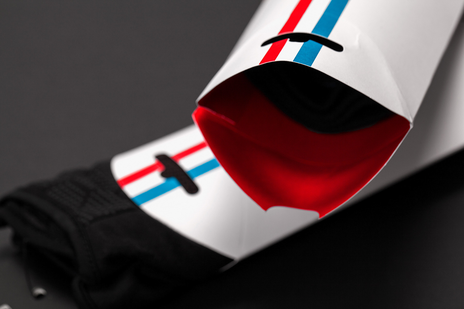
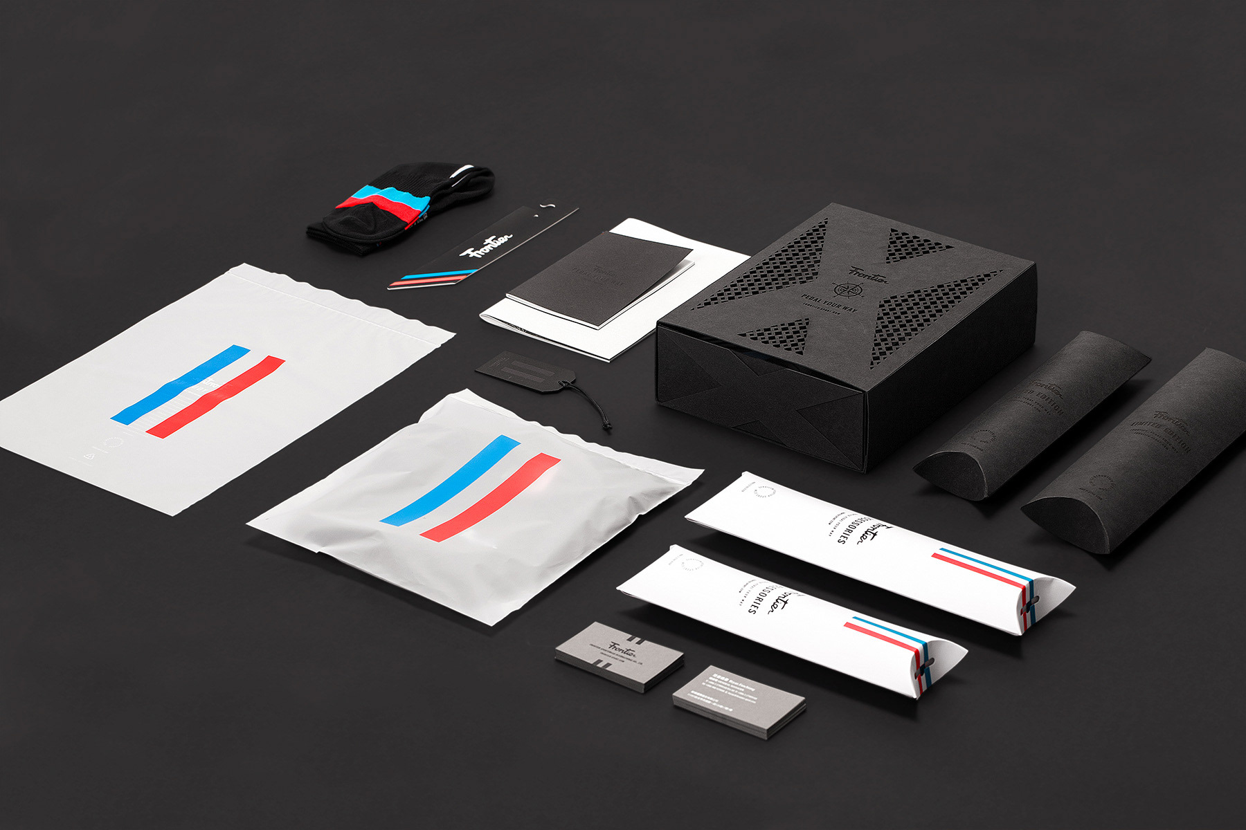
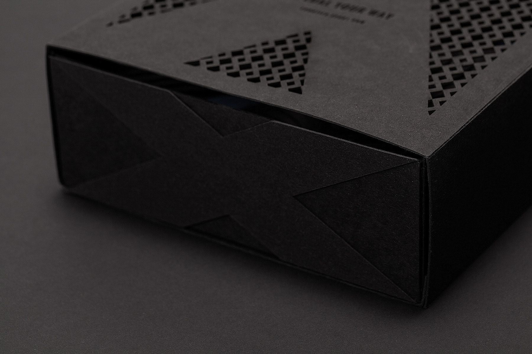
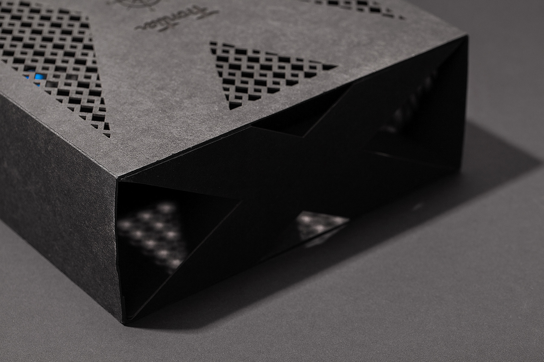
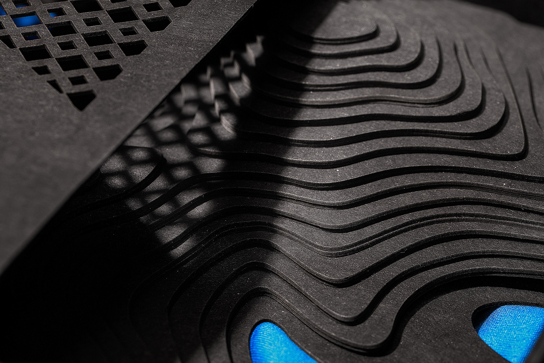
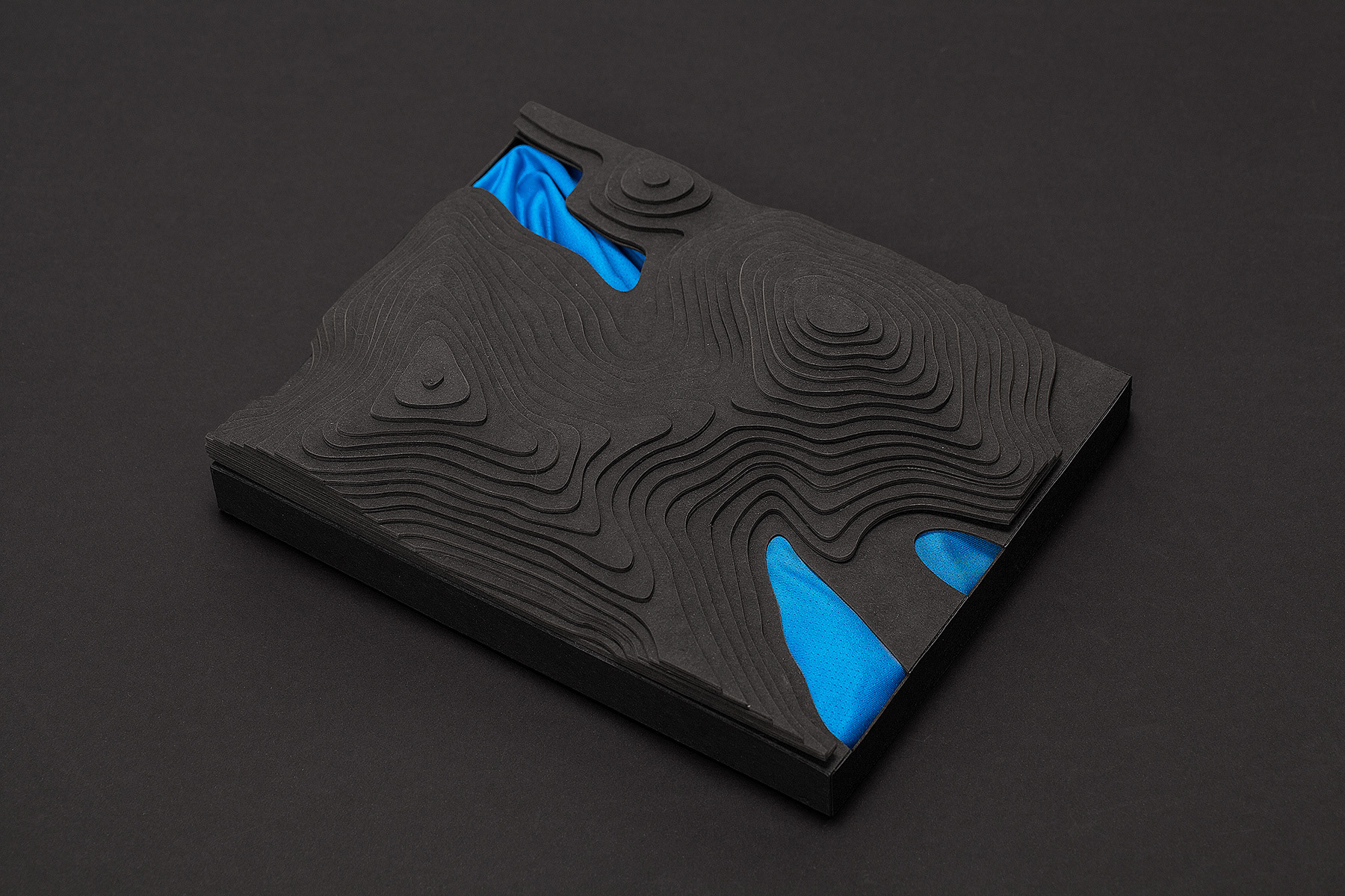
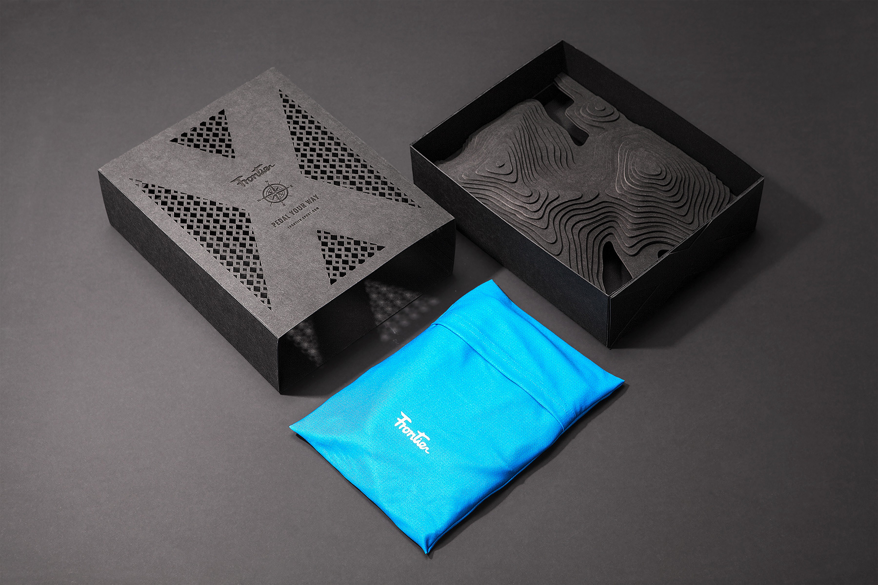
除了品牌整體形象設計外,今年更推出一款限量包裝設計,山林水。
In addition to our change in brand image, this year we also put forth a
limited edition packaging design, Mountain, Forest and River.
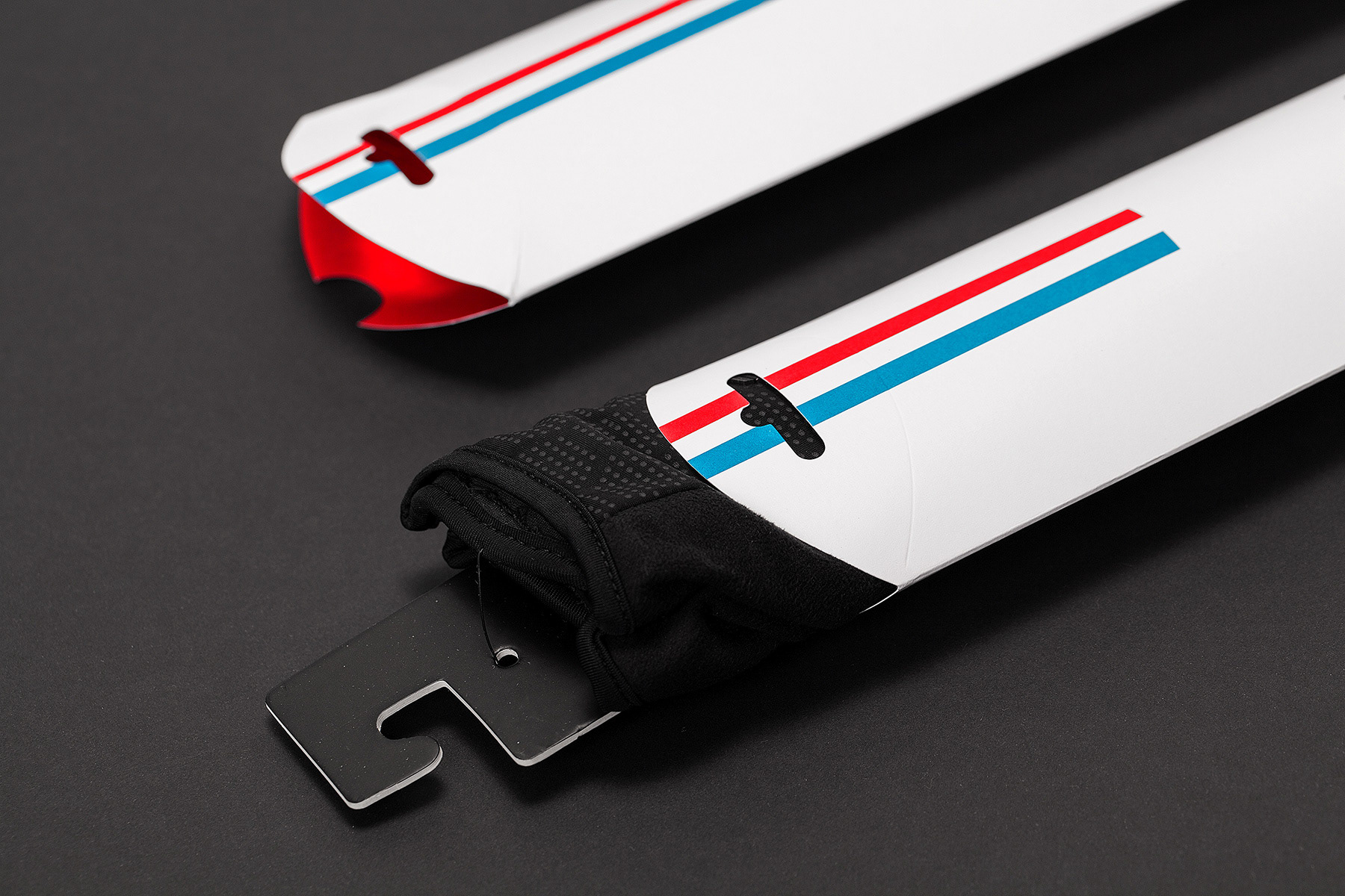
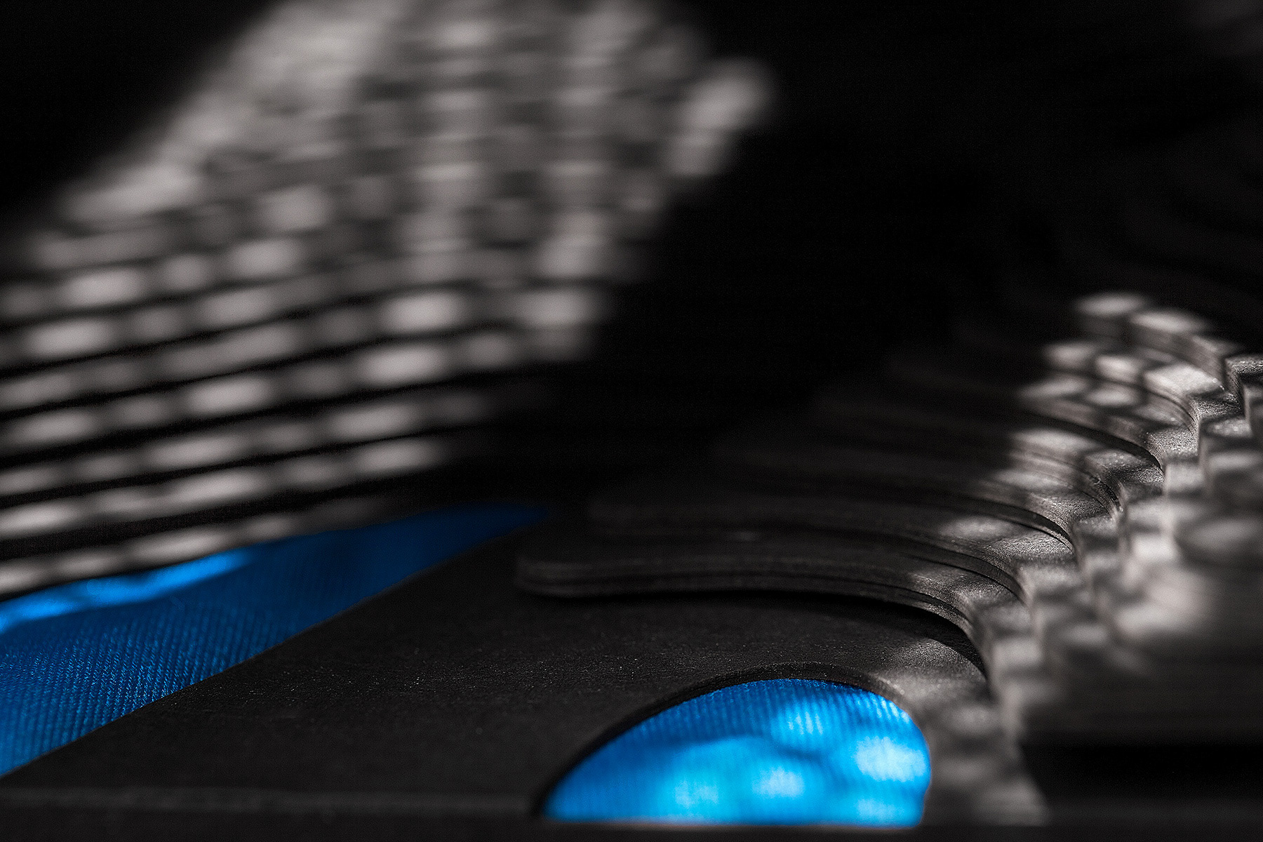
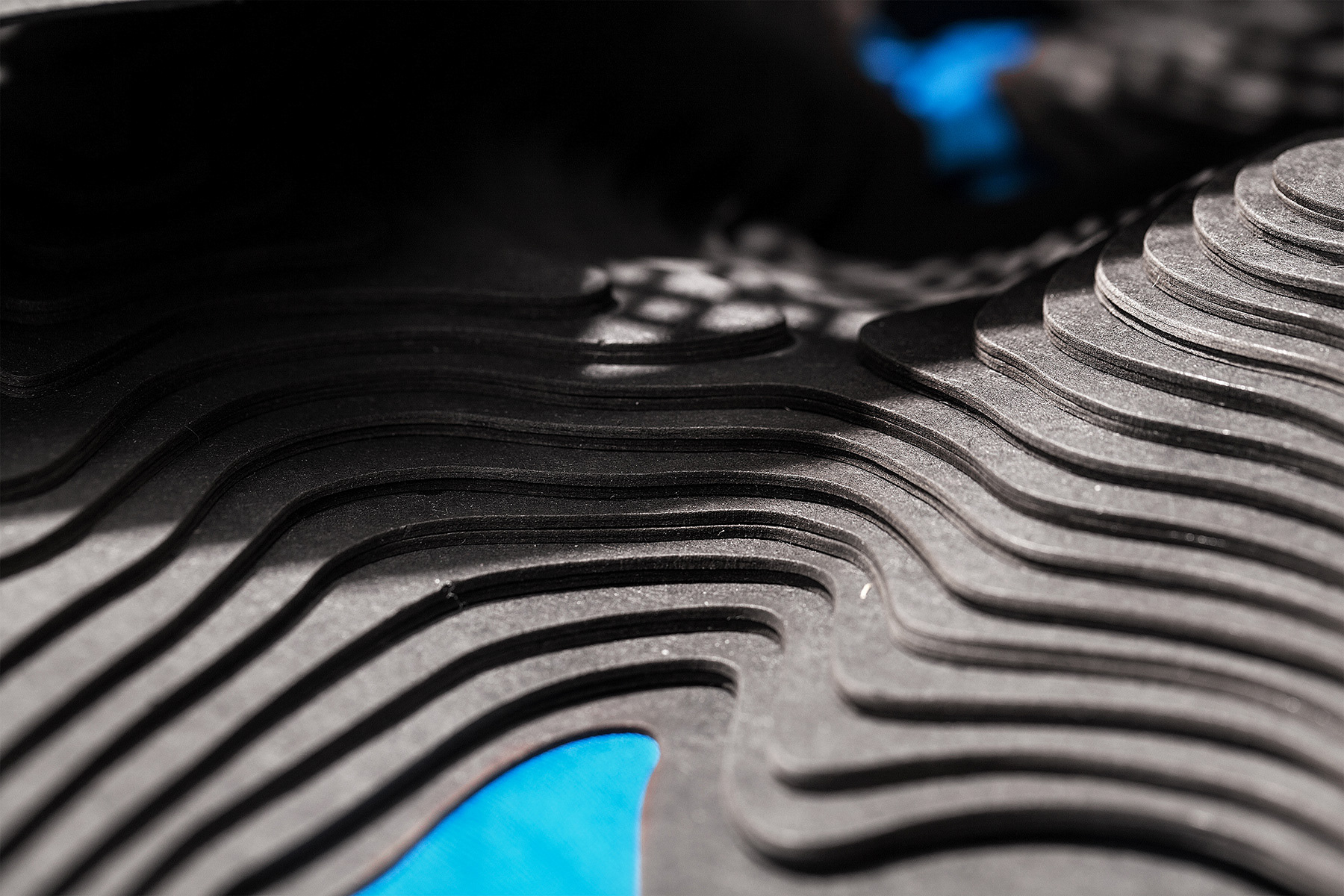
盒內可見等高線堆起的的山,正是合歡山的主峰與東峰,是台灣KOM賽事的主
要賽場,武嶺,就如同騎車時看見的台灣高山之美。外殼的簍空,呼應樹林與
樹蔭之間的間隙和光的變化,中間的羅盤順時針的轉動為盒內正確的合歡山方
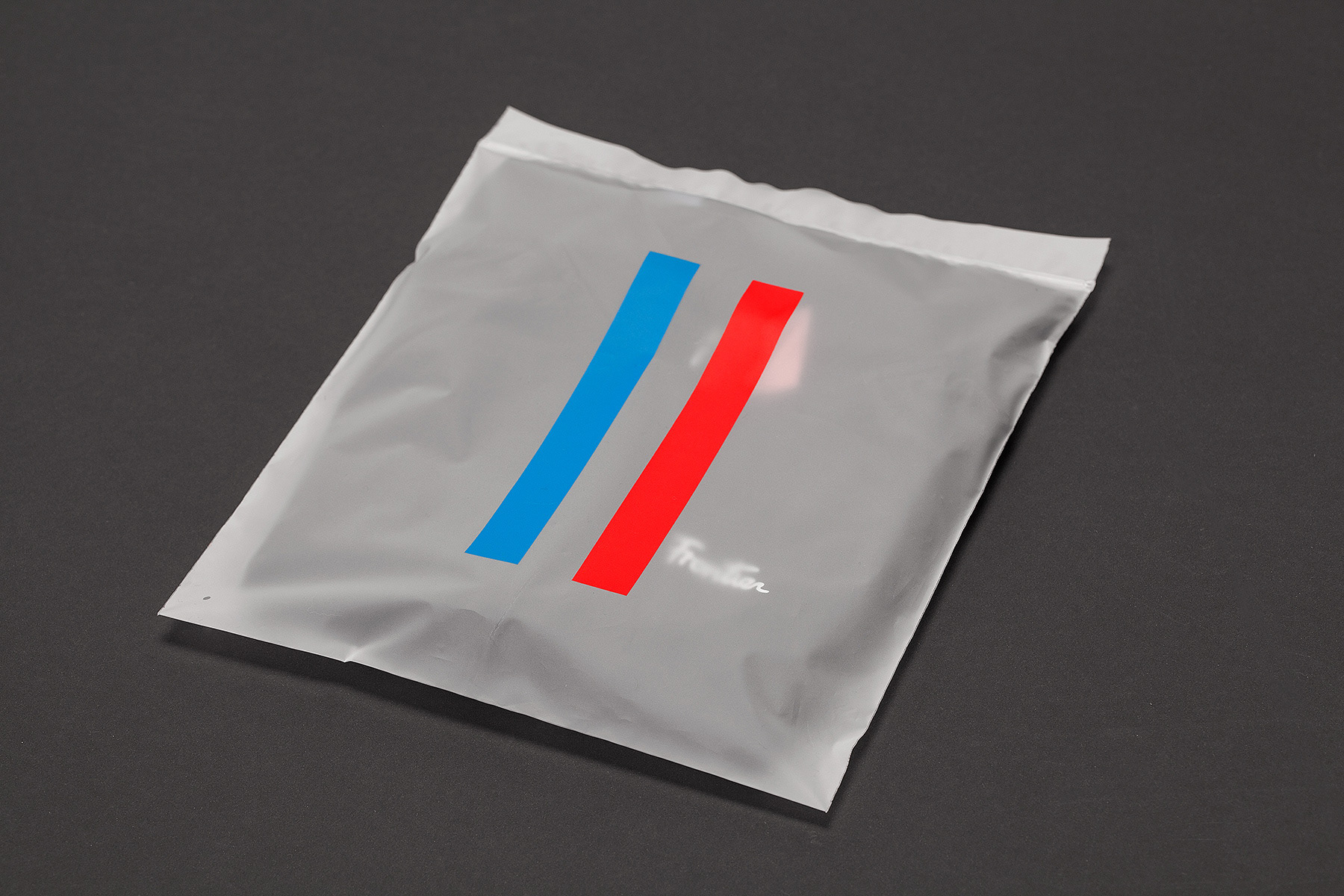
位。底部的水,以藍色的車衣防塵袋呈現,使用車衣相同布料縫製,柔軟的質
地有如水一般的可塑性,也就是高山底下的濁水溪與合歡溪。
Within the box, you can see the Taiwanese Hehuan Mountain countour
lines staggering in the background. The road from Hehuan mountain
main peak to its east peak is where Taiwan KOM Challenge takes place
every year, and this represents our gorgeous mountain landscape we
experience when we ride on this road to the mountaintop, Wuling.
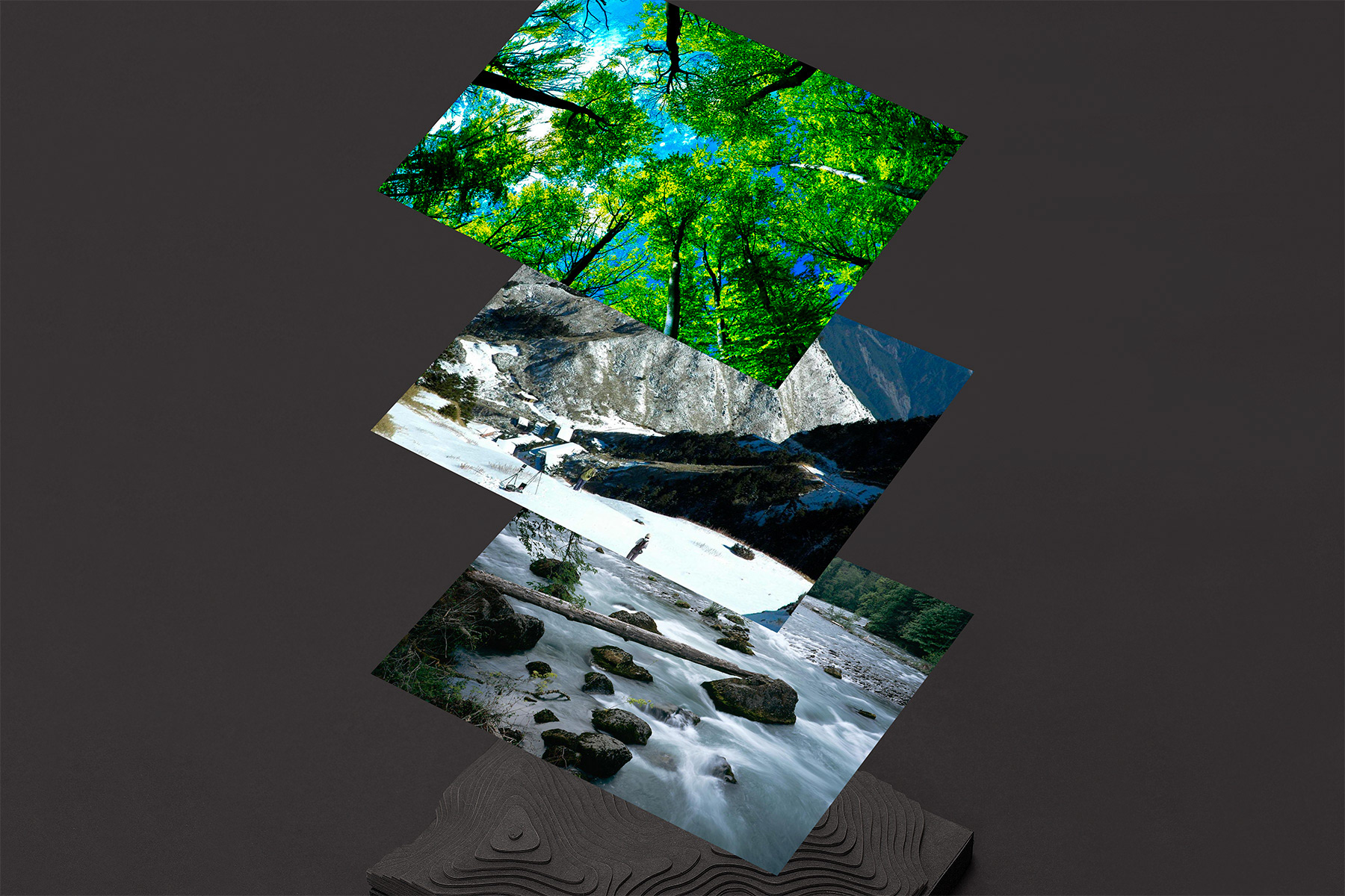


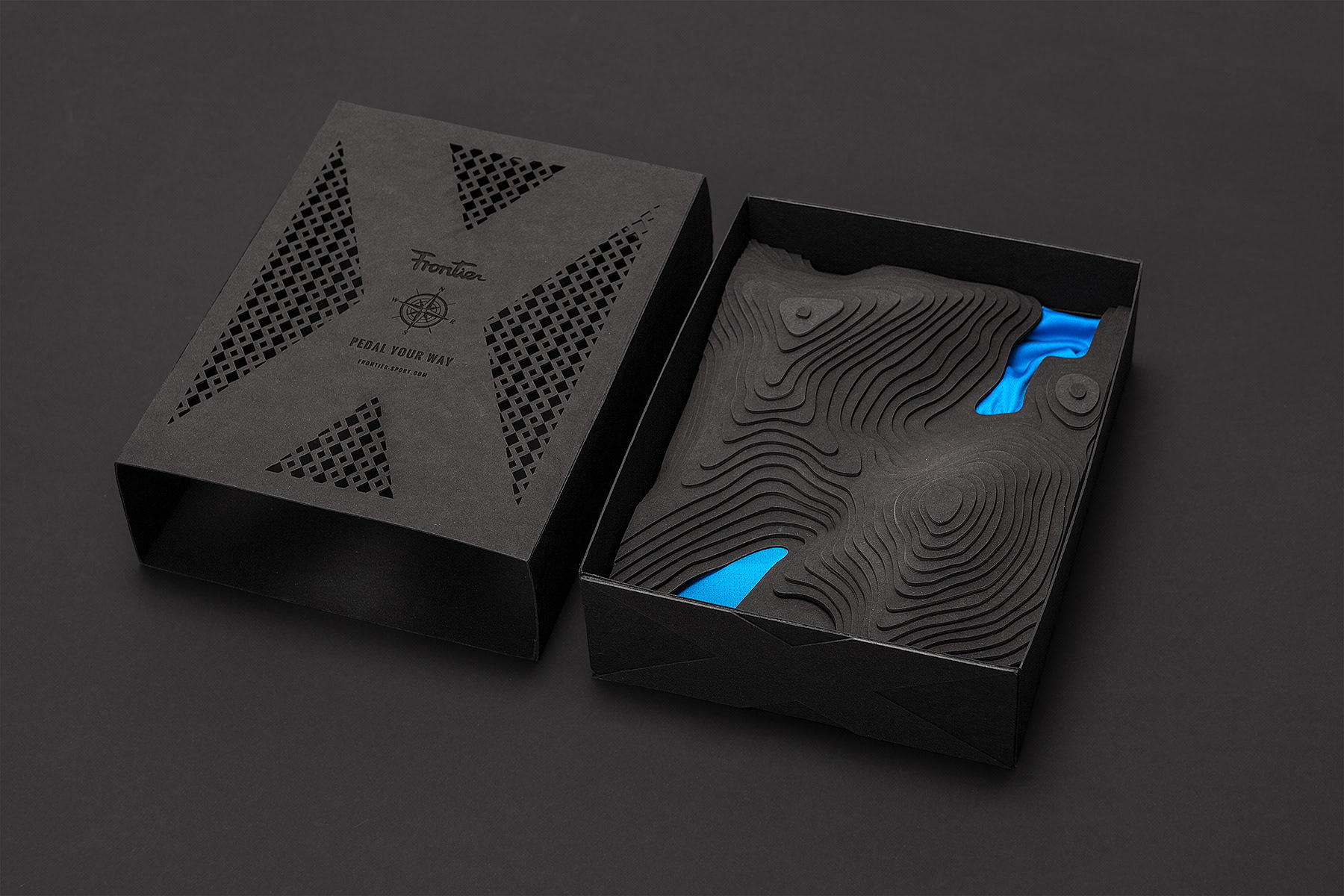
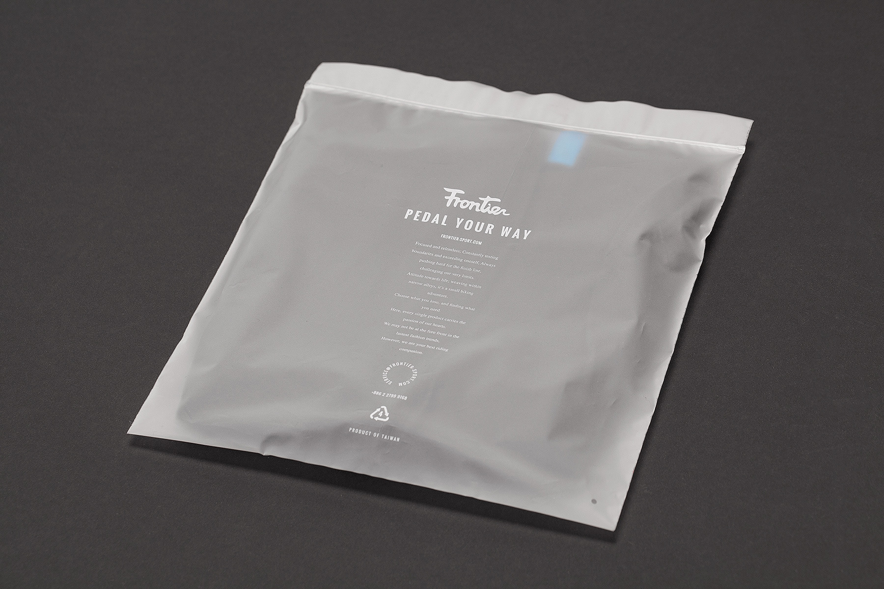
陽光灑下,樹影印在連綿起伏又壯麗的山景,濁水溪滋潤了大地並賦予我們生
命,這裡是不斷鍛鍊與留戀的地方,就如同Frontier這個品牌,以最好的商品與
服務成為車友們的最佳夥伴。
Accompany by the sun seeping through the forest leaves and the
Jhuoshuel River flowing within the mountain gorge, the sun and the
water nurture the mountain and endow us with vitality.
This is a place we come again and again for self-defiance and for our
love to this land. Sharing the same spirit, FRONTIER works on
spreading our love for this land and challenging ourselves to be the best
partner to all cyclists by offering the best products and services.