一本型錄,除了介紹商品還能有什麼內容?因此一本像雜誌一般的型錄誕生了。
裡面除了有商品,也有實用的文章與內容,讓型錄不再是翻看完就隨意丟棄。
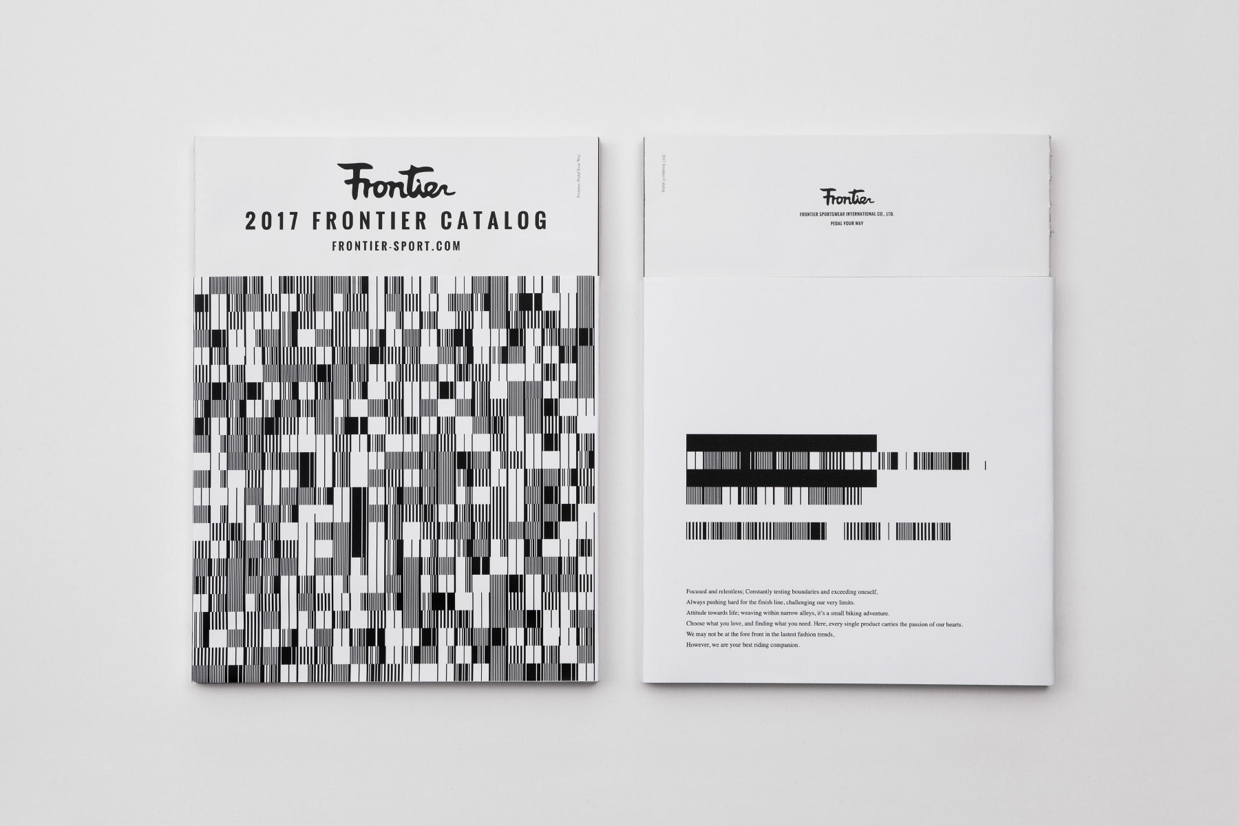
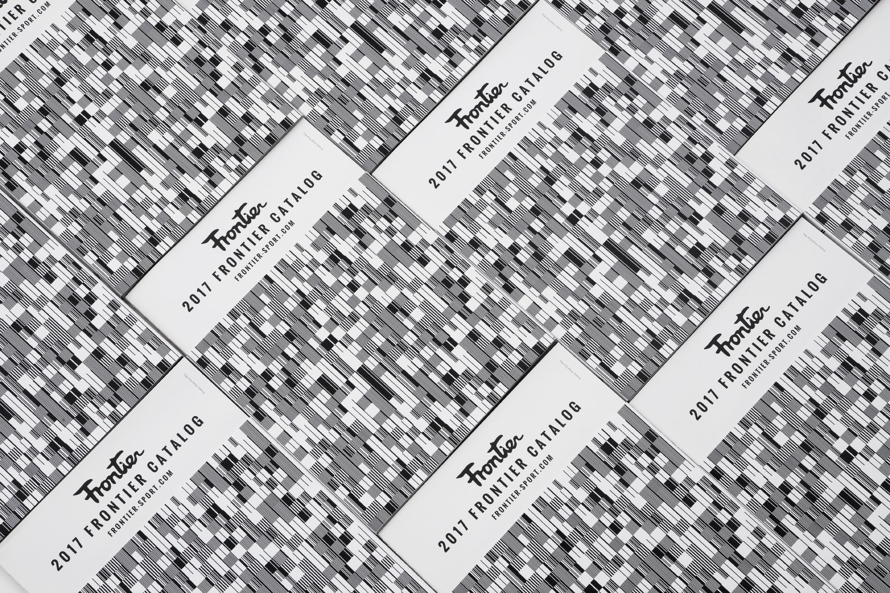
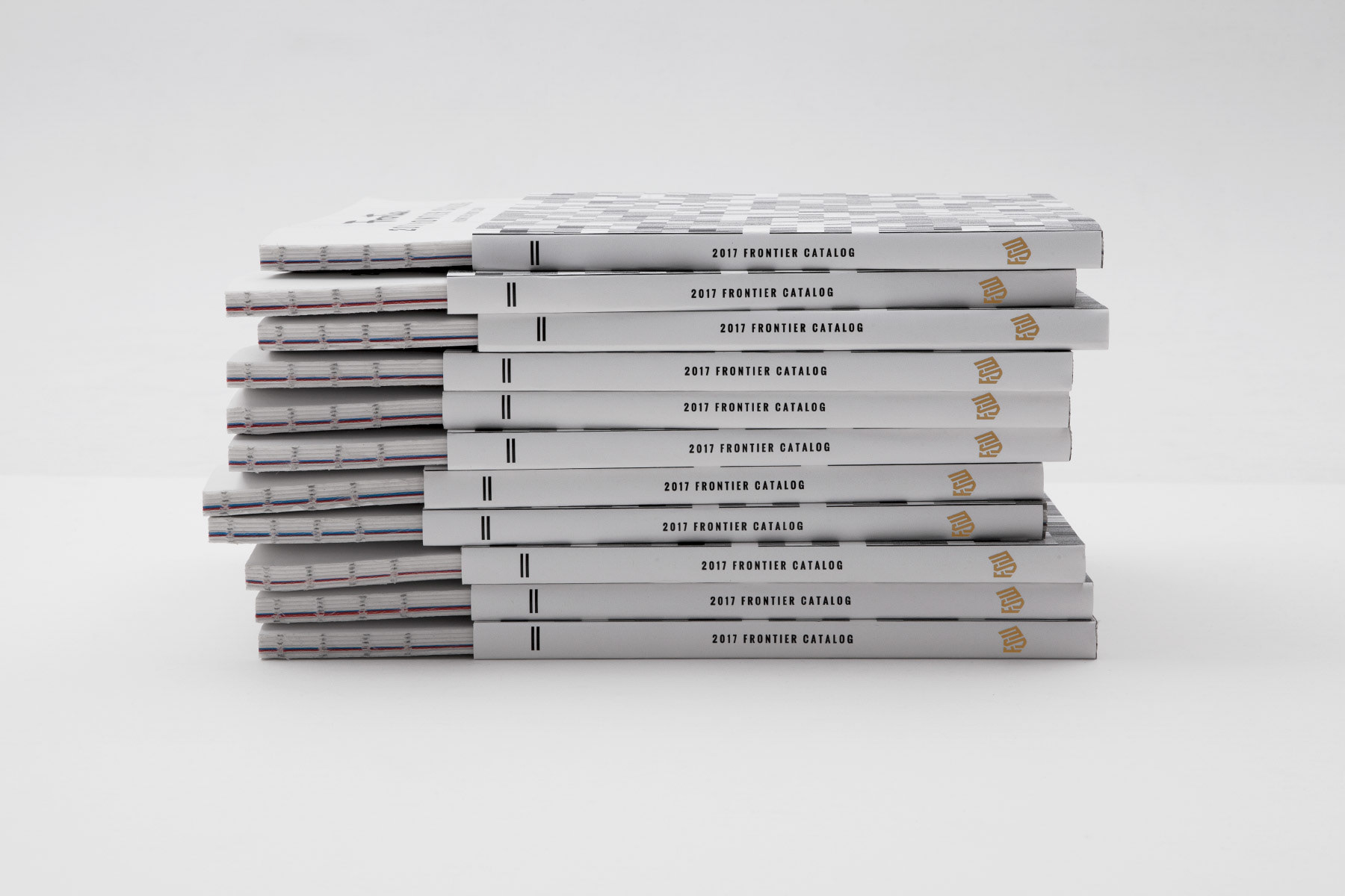
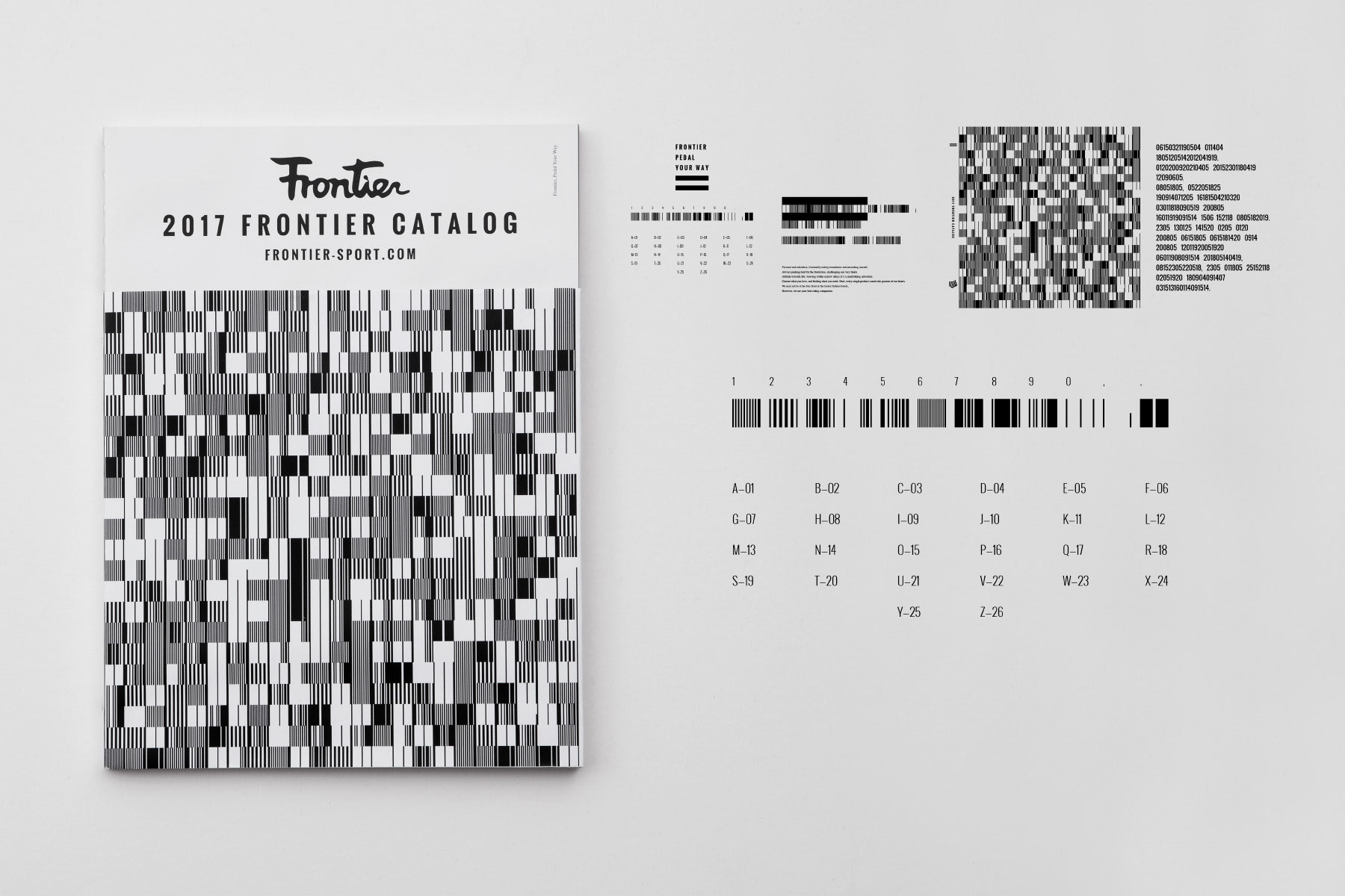
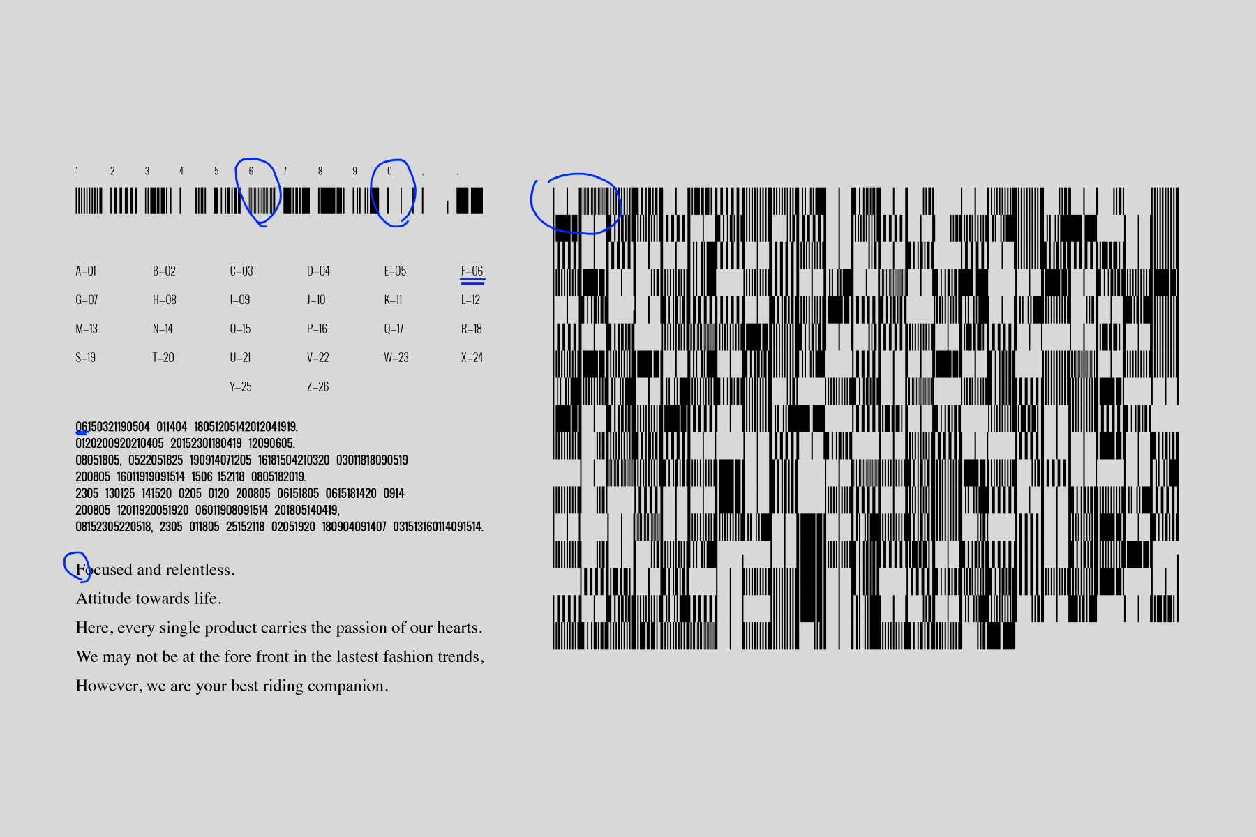
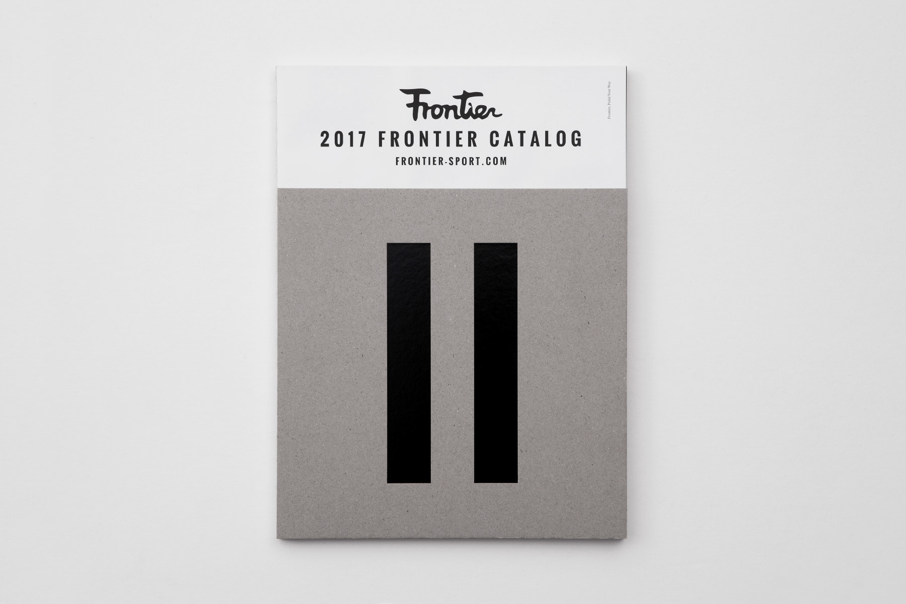
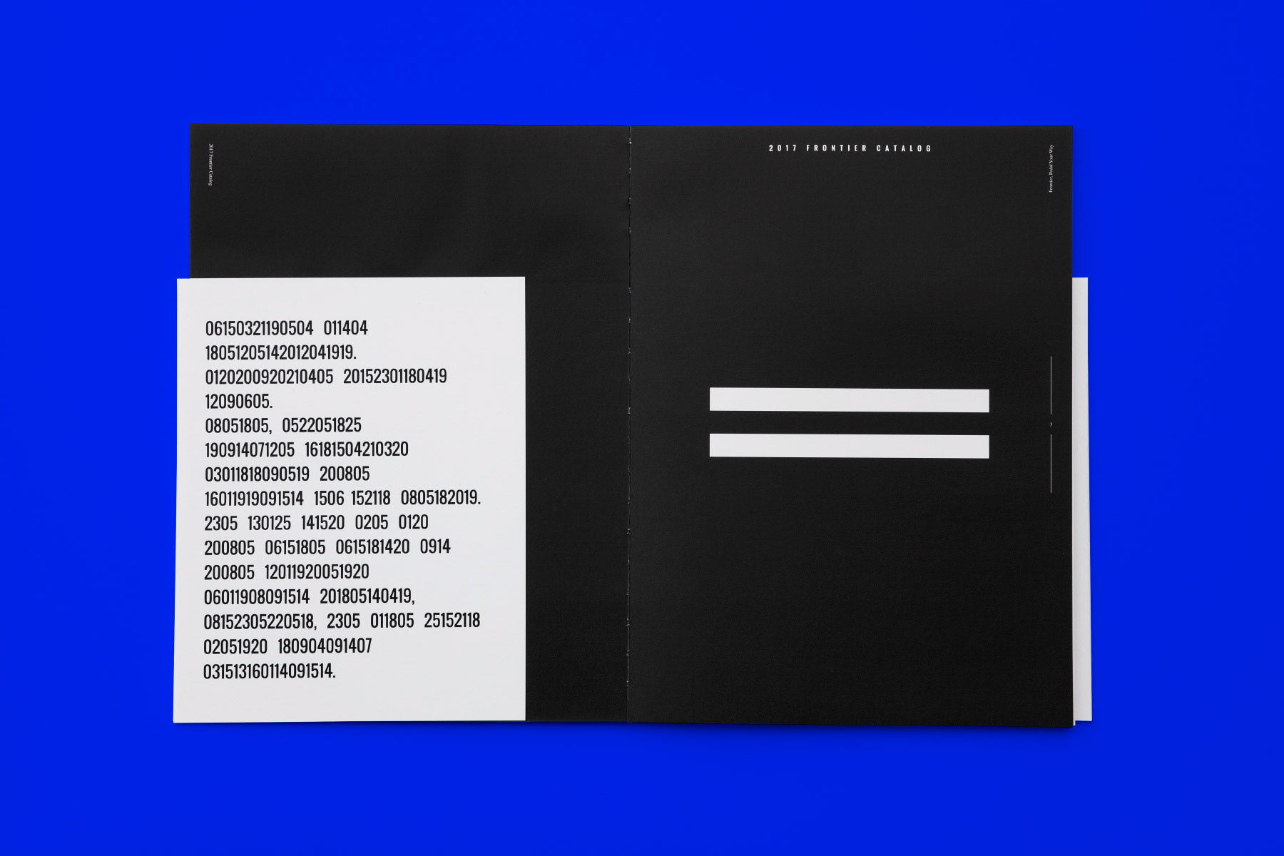
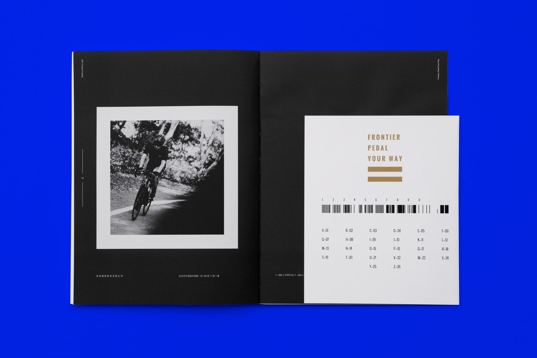
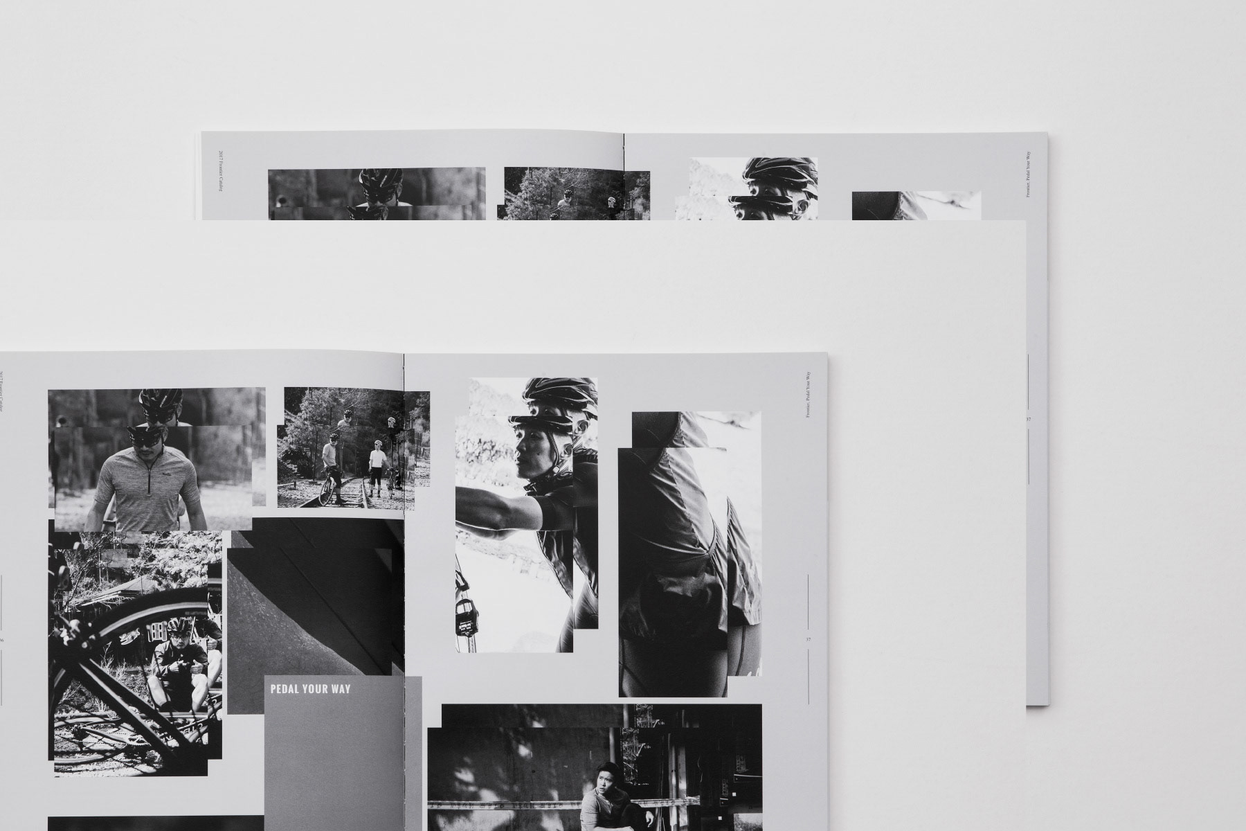
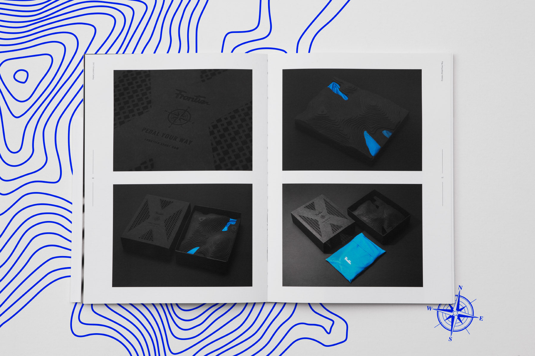
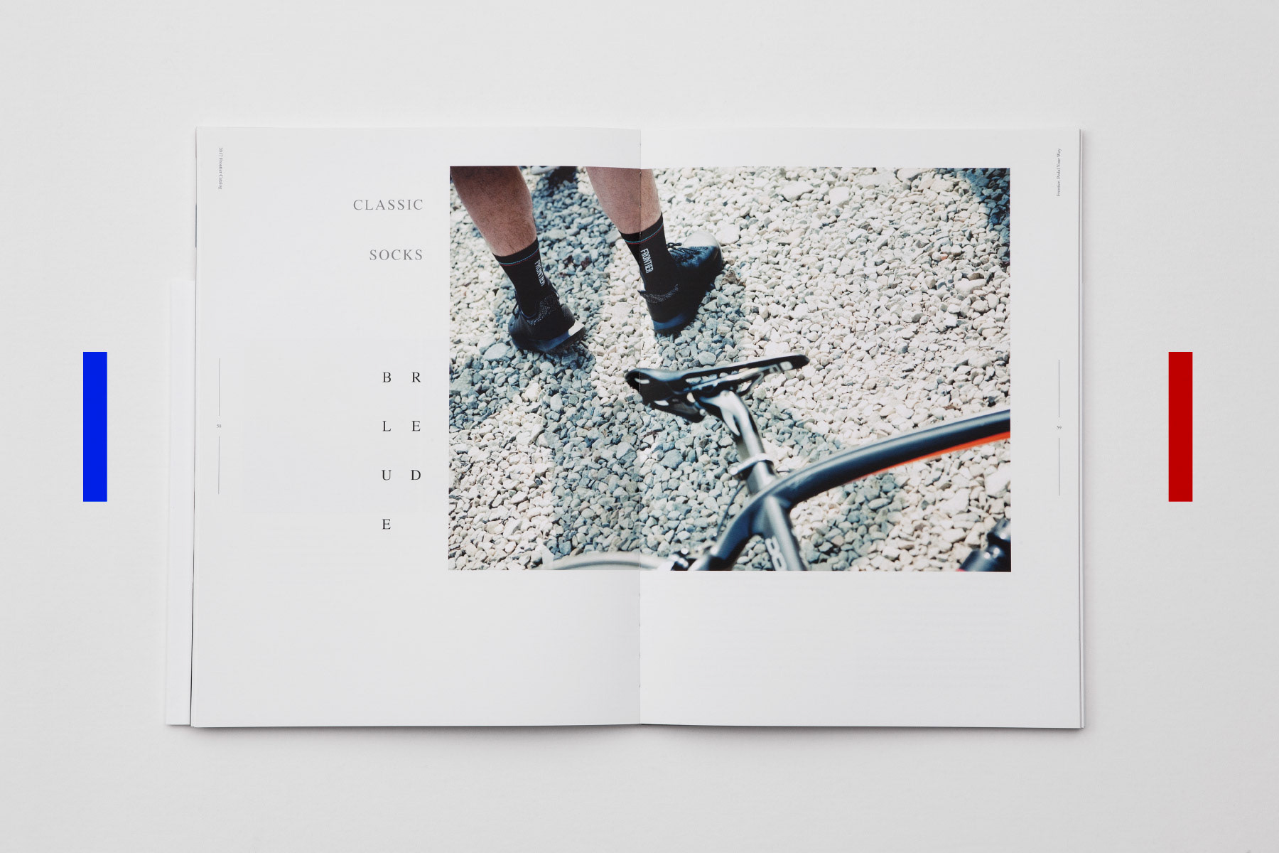
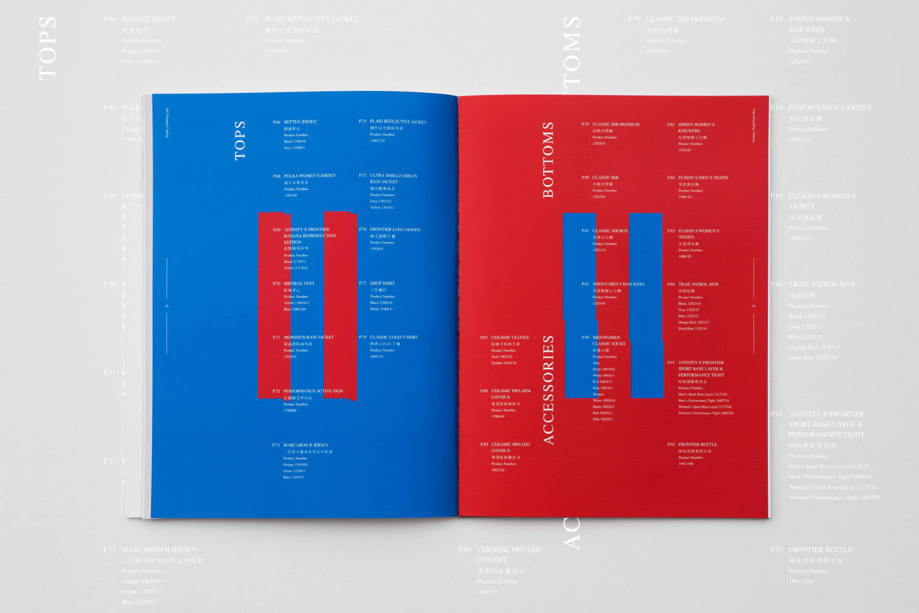
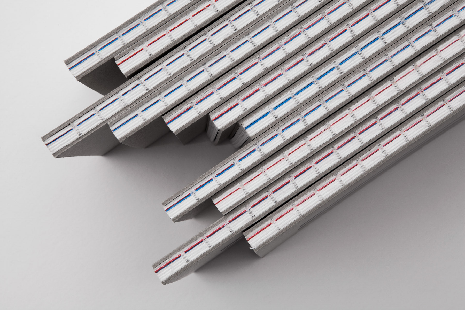
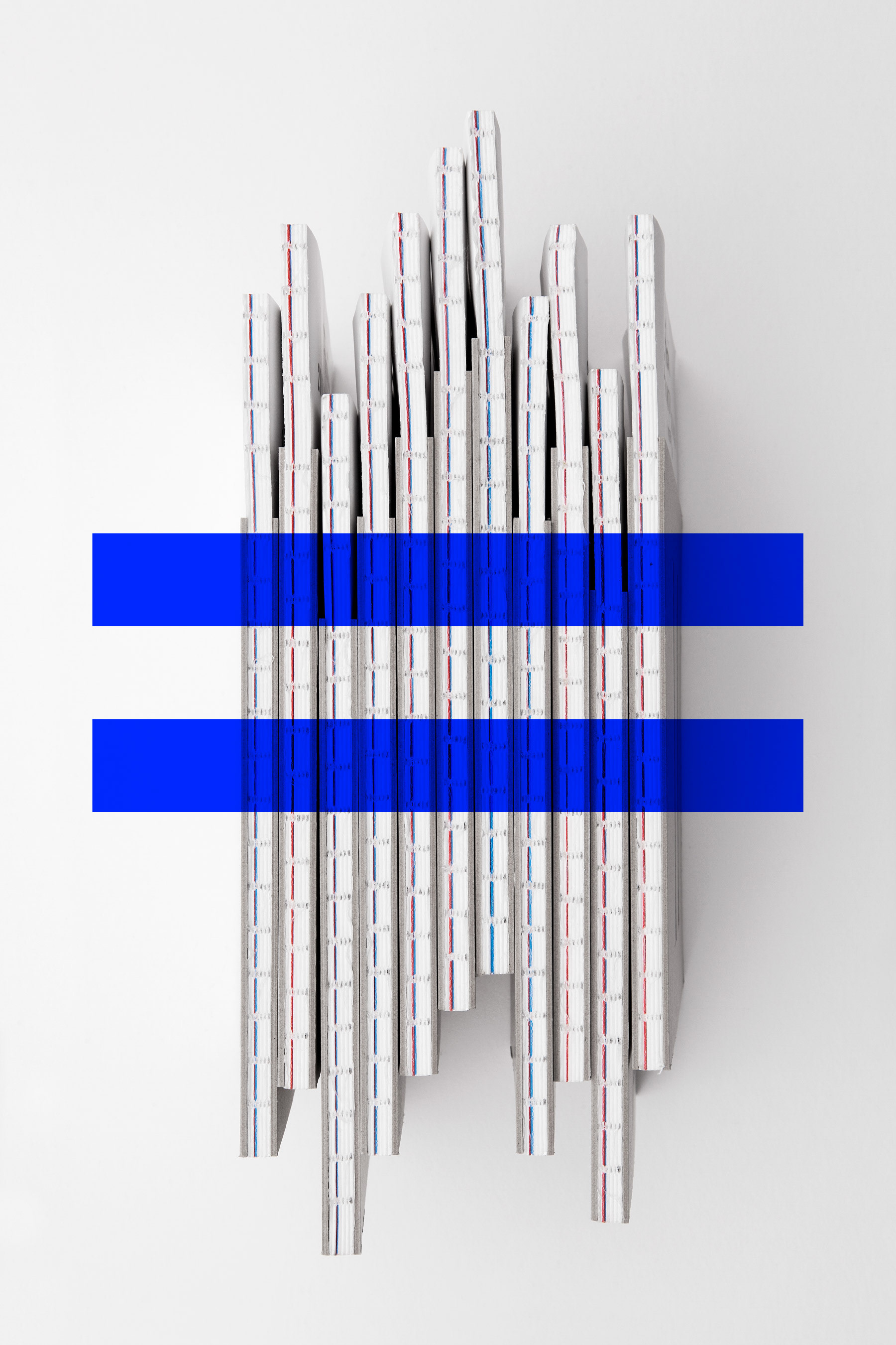
封面的圖騰是由條碼延伸而來,每一個英文字母代表一個數字,而每一個數字又有其代表的線條符號,整面圖像的組成就是Frontier的品牌精神文字。在內頁的編排上,除了依照不同的項目別,做內文的編排,更重要的是考量到品牌的主色藍與紅,特別在產品目錄頁使用了整頁的藍與紅,讓閱讀者加深品牌色的意念,也搭配頁數,在側邊使用穿線裸背裝,使其能剛好露出藍紅兩色的線條,整體相呼應。拿到這本型錄的人不止能瞭解產品,更能從這些小細節,更加深對品牌的認識,品牌也從其傳達經營者對於每個細節的用心。
It's a catalog also a magazine. This catalog is not only introducing products, but also include useful articles and contents. The cover pattern is extended by the barcode, each English letter represents a number, and each number has its representative line symbols. The composition of the cover is created from the text of brand spirit.
In the arrangement of the inside pages, use blue and red on full pages on product list pages. So that the customers will focus on the pages and easy to find the product they want to see. Also, consider the number of pages, use backless hardcover threading on the side. It can show the blue and red lines. The customers get this catalog can not only understand the products, but also more deep understanding the brand from these small details.